Hiển thị các bài đăng có nhãn Alfredo Marculeta. Hiển thị tất cả bài đăng

Thứ Bảy, 16 tháng 5, 2015

Joe 90: Top Secret (1969)

Cover by Frank Bellamy.
I had this comic as a child but sold them long ago. However I recently purchased several issues in excellent condition at fairly reasonable prices so it's time to give the publication some long-overdue coverage starting with the earliest issues. 

There's always been some disagreement about the actual title of the comic. Since childhood, some of us have always thought it was called Joe 90: Top Secret due to the ever-present 'stamp' on the logo. However, in the actual comics, letters pages, etc it's only referred to as Joe 90. To add to the confusion, the one annual that the comic spawned was definitely advertised as Joe 90/Top Secret Annual but that may be because the ad was produced by a different department. However I still prefer the longer title and to my mind it'll always be Joe 90: Top Secret but for the sake of brevity I'll just refer to it as Joe 90 for the rest of this post.  

Published by City Magazines in co-operation with Century 21 it was launched on 15th January 1969. Joe 90 was a companion paper to TV21 and followed the same format of having 20 tabloid sized pages, printed in high quality photogravure. Six pages were in full colour. The cover design of the early issues was quite distinctive, leading with a documentary style opening to the Joe 90 comic strip over the page.
It has to be said that unfortunately Joe 90 was one of the weakest strips in his own comic. I suspect the editors knew this too, which may be why the comic's full colour pages were devoted to two strong and dynamic supporting strips based on American TV shows. Before we get to those though, here's a quick look at an originated strip in the comic, Ninepence + Tenpence = Sport. Perhaps someone felt Joe 90 needed a traditional sports story, and created this serial of two Inuit boys with a talent for football. Drawn by Alfredo Marculeta, who had also been the artist of Rubberman in Smash! 
The free gift in Joe 90 No.1 was a cardboard model of the 'Jet-Air Car' from the series. Nowhere near as slick as the excellent Dinky toy but it was an amusing novelty with its matchstick and rubber band 'engine'. My gift is long gone but here's the page showing the instructions for it...
Proudly running across the centrespread of every issue was a strip version of Star Trek, excellently illustrated by Harry Lindfield. The one big drawback was... the TV series wouldn't premiere on British television for several more months (July 1969), even though it had been on American TV since 1966. Yes, for us as kids back then the weekly comic strip was our first knowledge of Mr.Spock, the USS Enterprise and Captain Kurt...
Wait. Did I say Captain Kurt? Yep, that's what he was called in the first two episodes of the comic strip! Presumably someone in editorial mis-heard the name. No videos or DVDs for reference in those days of course. 

Things got even stranger in Joe 90 No.2, where the script called for Harry Lindfield to draw a scene showing the Enterprise landing on a planet! Lindfield chose to have the starship hover just above the ground rather than add wheels to it.
Joe 90 seemed to be aiming to be more of a traditional tv comic than the shared-universe theme in TV21. Living up to the 'Top Secret' aspect was The Champions, based on the British secret agent TV series. Art by Jon Davis.
The other strip that was awarded the full colour treatment was Land of the Giants, based on the popular Irwin Allen show. Great artwork by Gerry Haylock. The first three issues adapted the first episode. Considering how accurate it was I'm sure Gerry Haylock must have had access to numerous photographic stills from the episode. Here's the full adaptation from issues 1 to 3 of Joe 90...


Towards the end of Joe 90's short run of just 34 issues it became obvious that the title character wasn't the selling point, so Land of the Giants and Star Trek took turns to appear on the covers. In September 1969 Joe 90 merged into TV21 and restarted as TV 21 and Joe 90 with a new No.1 (although the merged comic was more like Joe 90 than its parent title). 

I'll take another look at some issues of Joe 90 soon, with a focus on the Joe 90 strip itself. In the meantime, here are the covers to issues 2 and 3. Click on them to see them full size...

Thứ Sáu, 16 tháng 5, 2014

This week in 1966: HULK SMASH!

It was 48 years ago today when Odhams Press Ltd. began their association with Marvel Comics by publishing reprints of The Incredible Hulk in the pages of Smash!

Yes, I know some sources claim that reprints of The Fantastic Four began in Wham! first, but that's not true. (Trust me. I have the comics. The FF came to Wham! a little later.) It was the issue shown here, Smash! No.16, dated 21st May 1966, that was the first Odhams weekly to feature a Marvel reprint.

Curiously, they started by reprinting Incredible Hulk No.2 rather than the first issue, but what a great choice! The opening image of the Hulk emerging from the swamp (by Jack Kirby and Steve Ditko) was a perfect and powerful way to introduce the character to British readers. (Parts of Hulk No.1 were reprinted in following weeks, and the origin chapter in Fantastic in 1968.)

The original Incredible Hulk comics (and his following appearances in Tales to Astonish) had been available in some UK newsagents but distribution was unreliable. The reprints in Smash! were the ideal way to showcase a consecutive run of Hulk stories and, for many of us, were our first discovery of the character.

Due to the page size of British comics being considerably bigger than American comics, panels from the Hulk stories were arranged to fit more onto each page. This first appearance of the Hulk ran to six pages in Smash!, - roughly 11 pages of the American comic. 

The editorial in the letters section gave The Hulk a shout out, and encouraged readers to hold on to this issue...

What else was in this landmark issue? Well, some excellent new British material, that's what! Let's have a look at a few highlights, starting with the brilliant Man from B.U.N.G.L.E. cover by Brian Lewis at the top of this post.

On pages 2 and 3 was the second chapter of a strip that had begun the previous week, - The Rubberman! Story by Ken Mennell with art by Alfredo Marculeta...


Ken Reid's Queen of the Seas is always worth showing here...


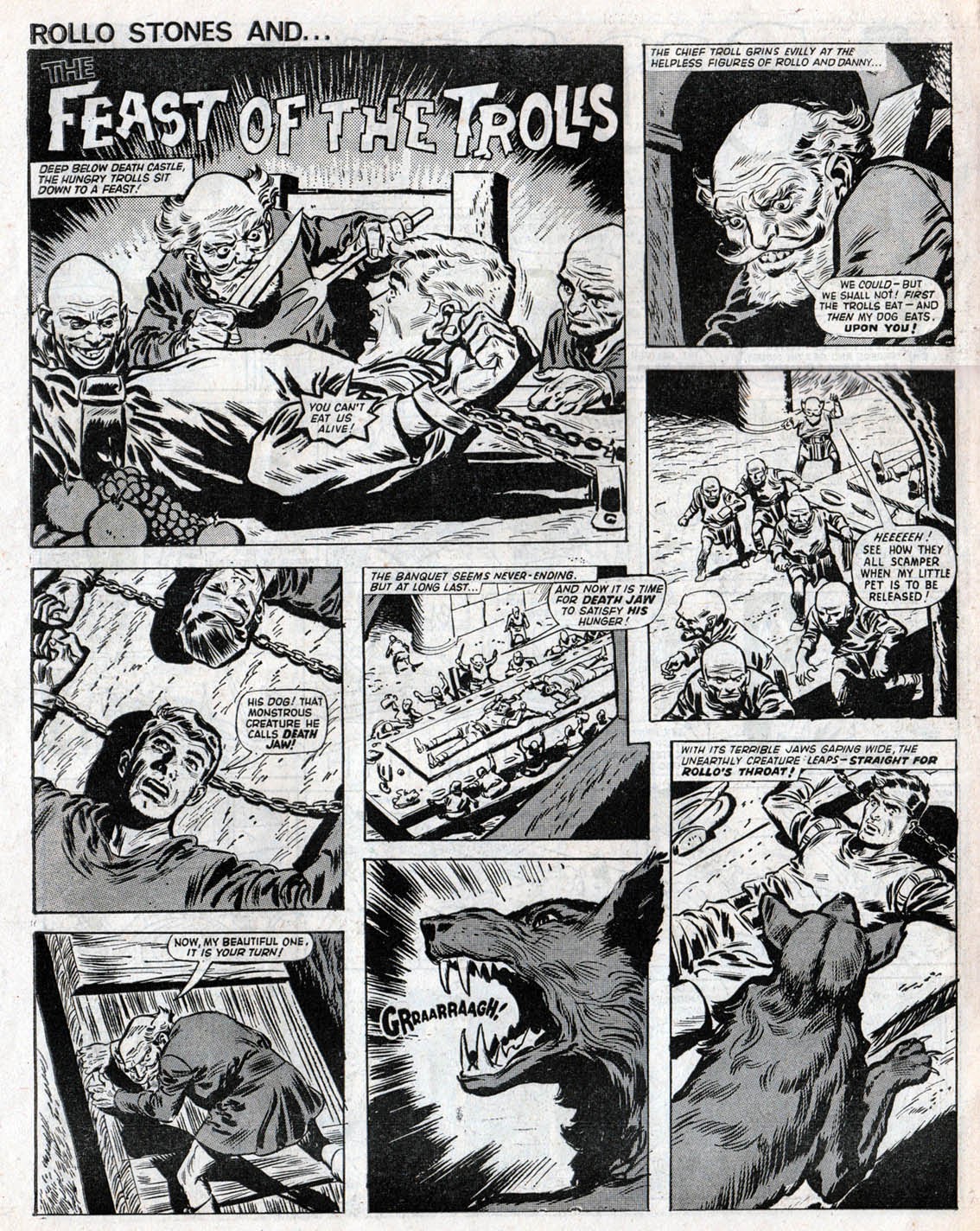
This next offering is The Legend Testers, although it had dropped its regular title that week to be called The Feast of the Trolls. And as I found out, you should never feed a troll. Excellent horror comic art by Jordi Bernet...


On the back page of this 28 page issue, Grimly Feendish. Artwork by Ron Spencer I think, or perhaps Mike Lacey. Someone ghosting Leo Baxendale's style anyway (but it's definitely not by Leo). 

These early issues of Smash! were some of the most entertaining comics of the sixties. Humour, horror, superheroes... it had the lot! I remember having a few issues of The Hornet and Victor around that time and thinking how mundane and ordinary it seemed in comparison. Admittedly, Smash! didn't sell as well as many of its rivals, but the more formalised comics have often been the most successful. Smash! had its own identity, as did its stablemates Wham! and Pow!, and they captured the mood of the times better than most other comics. Comics such as Valiant and Hotspur were better structured and slicker, but Smash! was cooler.